 My husband is more detail-oriented than I am… I tend to be more big-picture. This comes in very handy when there are little aesthetic decisions to make. He helped with the logo when it was being designed, which now we both love. He always seems to know right away… No, No Jen. The logo can’t be round. It has to be square… And the frustrating thing is that he is usually right in the end!

Then fonts… I have basically been using two fonts for Naturalmente Mediterráneo. The Logo and name font and then a different font for any other wording. I have loved my “any other wording” font. It is creative, unique and artisan. My frustratingly practical husband, however, said right from the beginning that he wasn’t convinced, it’s not easy to read. Well, I went ahead and have been using that font…. Until very recently.
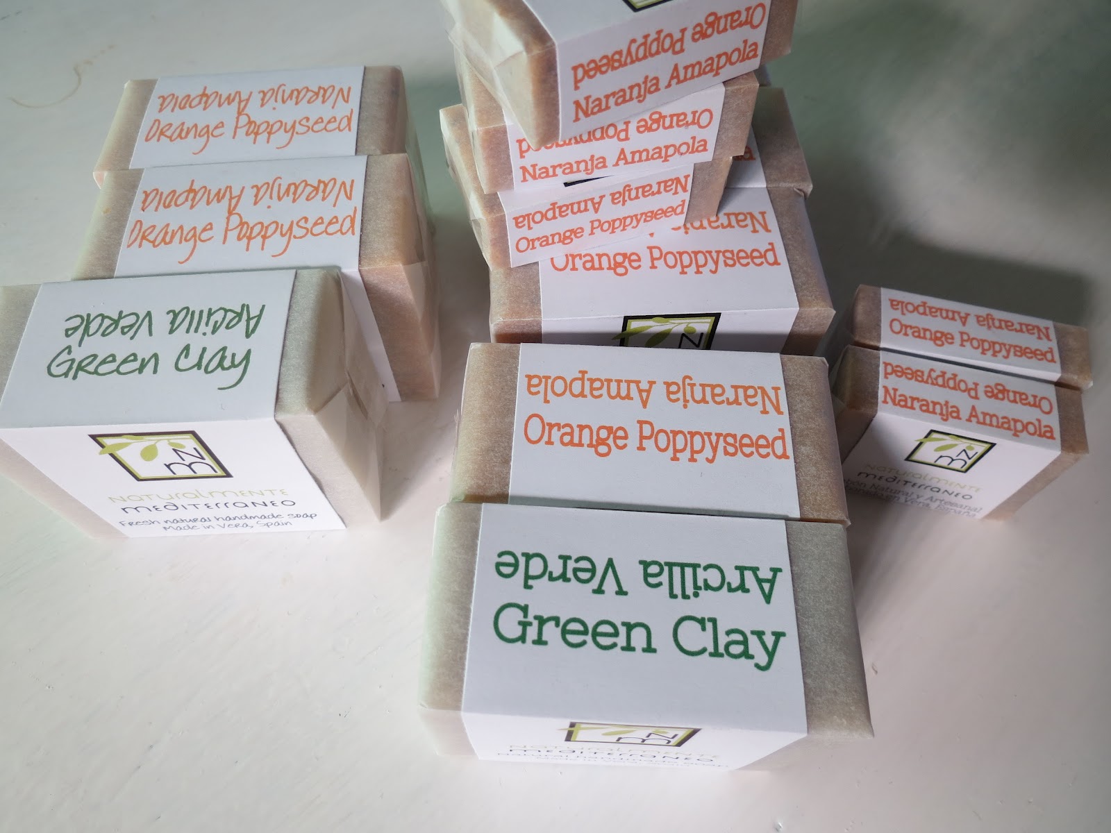
Okay, beautiful and creative are nice, but isn’t purpose, performance and end-use the focus of my products? So why am I focusing on the aesthetics rather than purpose in something as important as font? Font is about getting my message across. After more and more people mentioned they cannot read it easily, I recently switched. Gives things a completely different look. Less Artisan but VERY readable. I think he was right again.

Hope you are all well and enjoying this marvelous life daily. I really do believe that it is our choice.
Happy happy happy soaping!!
Xoxo
Jen

0 Comments